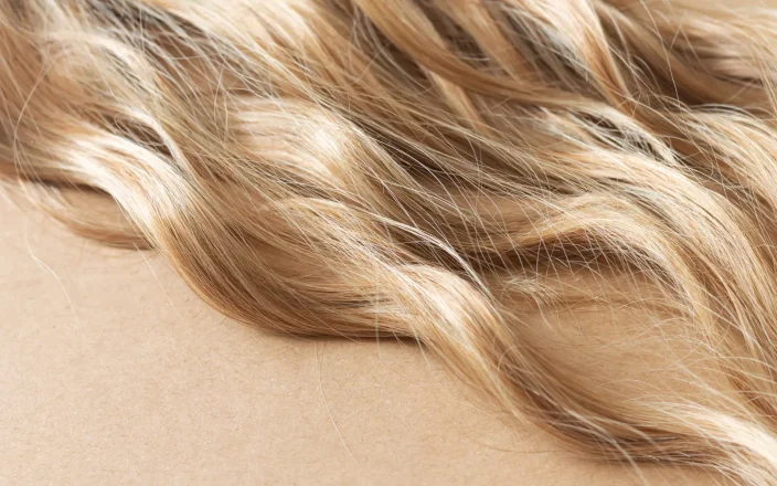

A lofty white neutral whose aerated presence acts as a whisper of calm and peace in a noisy world. PANTONE 11-4201 Cloud Dancer symbolizes a calming influence in a society rediscovering the value of quiet reflection.
A billowy white imbued with serenity, it invites true relaxation and focus, allowing the mind to wander and creativity to breathe.
In motion and in pause, Pantone Color of the Year 2026, PANTONE 11-4201 Cloud Dancer drifts between light and ethereal, a living calm that invites renewal, vision in serenity and creative release,
– @pantone.
View this post on Instagram
Michelle Summers Davies, Michelle Davies Hair, Pembrokeshire.
“Cloud Dancer is my kind of shade – calm, classy and confident without shouting for attention. It’s minimalist, but it still stands out. It feels clean, modern and considered, which I love. For colourists, this kind of neutral is gold. It gives you a clean canvas to build anything on and every palette looks better sitting next to it. It quietly elevates bolder tones and keeps softer colours looking refined. When we’re working with blondes, keeping them creamy, soft and polished sits beautifully alongside this sort of white. What I really like is that this tone speaks without trying too hard, it’s calm, professional, and classy. It reflects what so many people want now, less noise, more clarity. Whether it’s in interiors, fashion or hair, Cloud Dancer lets the work shine, and that’s exactly why it lands.”
Dean Lawton-Taylor, Trinder Hair Studios, St Albans
“I am already obsessed with this colour! I love it, who doesn’t love a gorgeous clean, neutral white? This colour is perfect for all year, summer through to winter. This colour is so versatile, from global blondes to balayage and highlights, even a few pieces of that Cloud Dancer through a darker base would look stunning, especially in a grey blend.”
View this post on Instagram
Georgina Greenslade, The Hair Movement, Sidcup
“I think Cloud Dancer is beautiful, it is very soft and graceful, perfectly balanced and very luxurious. It definitely brings peace and restfulness just by looking at it, the colour is a soothing silence which gives a sense of ease. Bringing this shade into a colourist’s palette offers a soft, neutral tone that many people prefer today. It adds brightness without being harsh, creating a more natural effect. I believe it’s a beautiful, versatile colour that can be easily adapted into the work of any colourist. In my opinion colour isn’t just something we wear, it’s part of how we are and it helps us show who we are, what we’re feeling, and the kind of impact we want to make. I find that using colour makes you feel a little more confident, more expressive, and a lot more empowered.”
For more info please visit www.pantone.com/color-of-the-year/2026.
View this post on Instagram